Calm Cup Visual Direction
FREELANCE CLIENT: Yena P. Founder of Calm Cup
ASSETS PROVIDED: Pitch Deck, Logo Design, Branded Design Elements, Storefront Mockups
BRIEF: In a chaotic, overstimulated world, Calm Cup is your place of serenity. We’re redefining the cafe experience for Gen Z. A place where individuals can take shelter in a calm, curated environment, all centered around matcha. It should feel like a reprieve from everyday life. The brand is youthful, strong, delicate, and mindful. It’s not just a beverage, it’s a moment.

VISUAL DIRECTION
Taking cues from the ideas of serenity in Japanese culture, I focused on the patterns of zen gardens, art of bonsai trees, the undulent and hypnotic motion of waves and how that translates to the movement of beverages, the meditative elements of nature. And finding a balance between stripped back minimalism and punchy bold visuals that align with a younger audience. So I created digital moodboards of possible vibes and aesthetics I wanted to carry through.


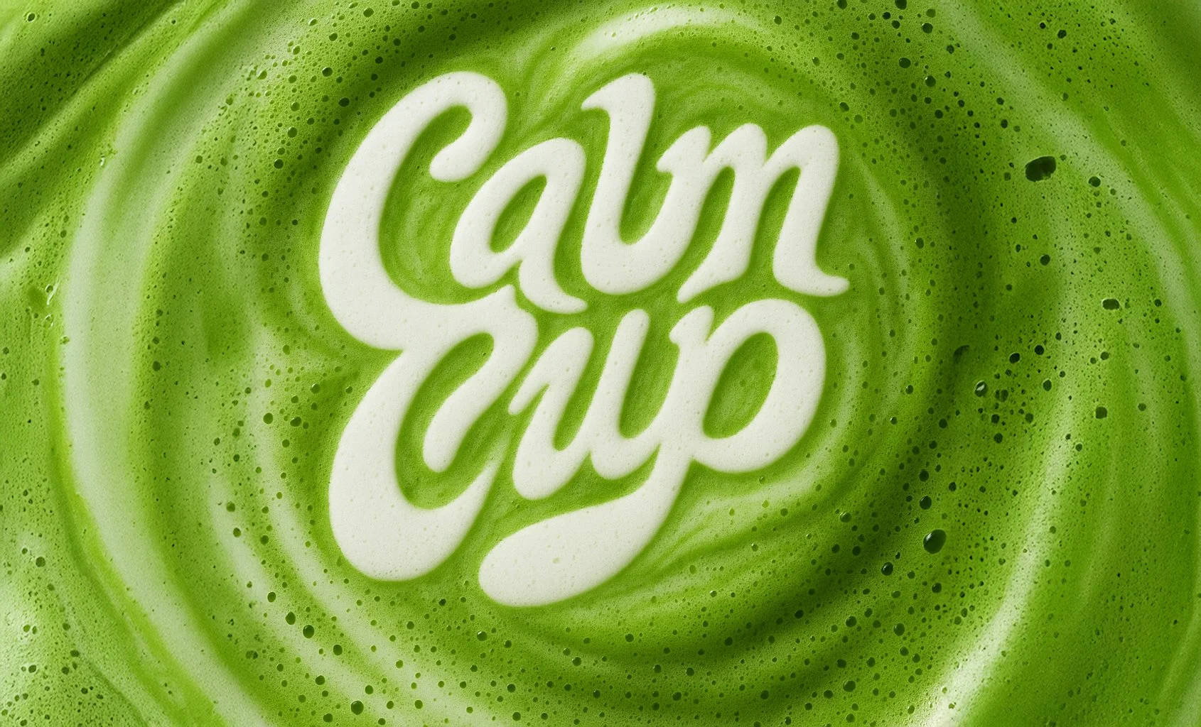
THE LOGO: Inspired by the foamy formations created in a freshly poured cup of matcha, I wanted to reflect the waves and line movements of freshly whisked matcha.


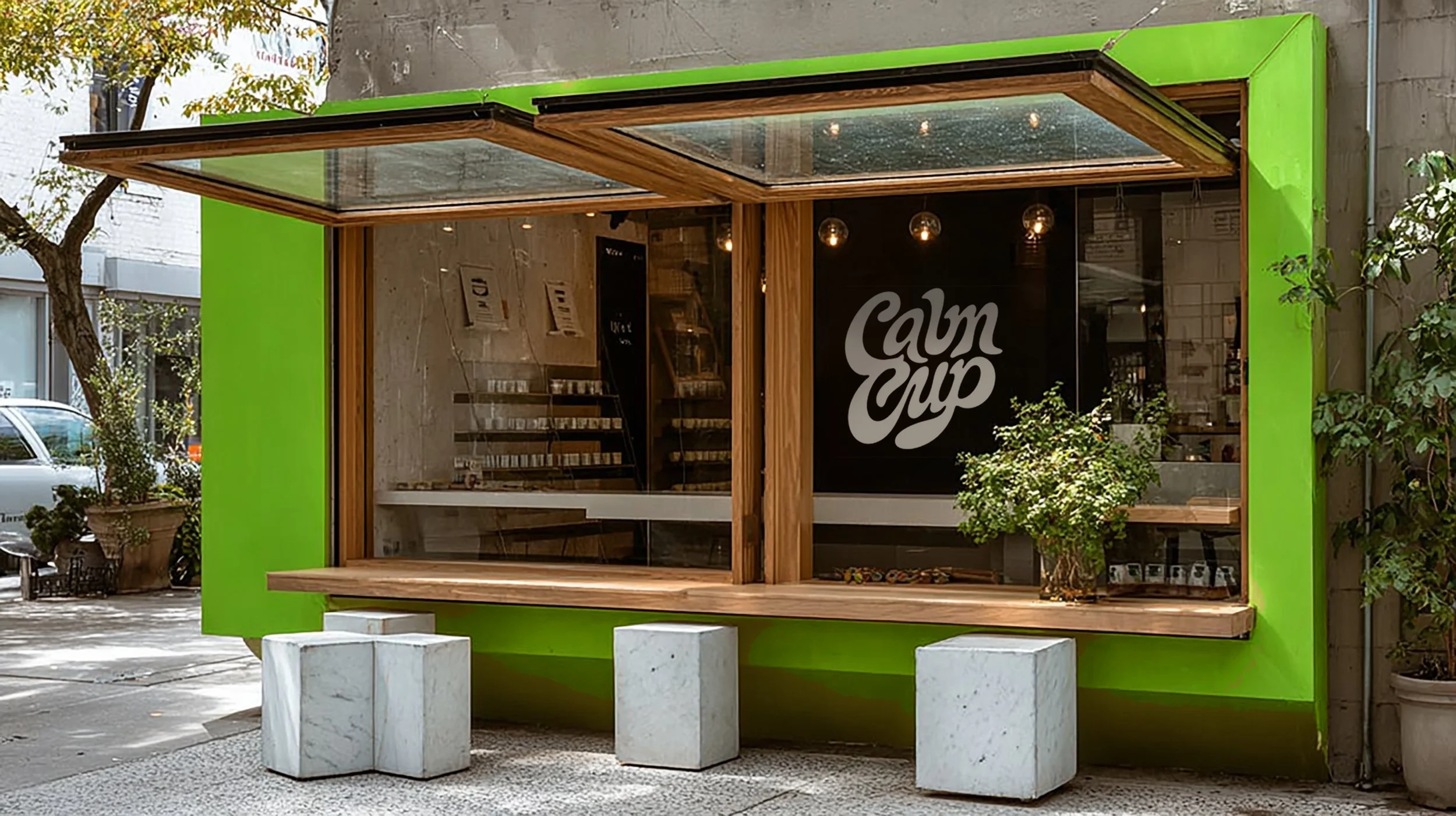
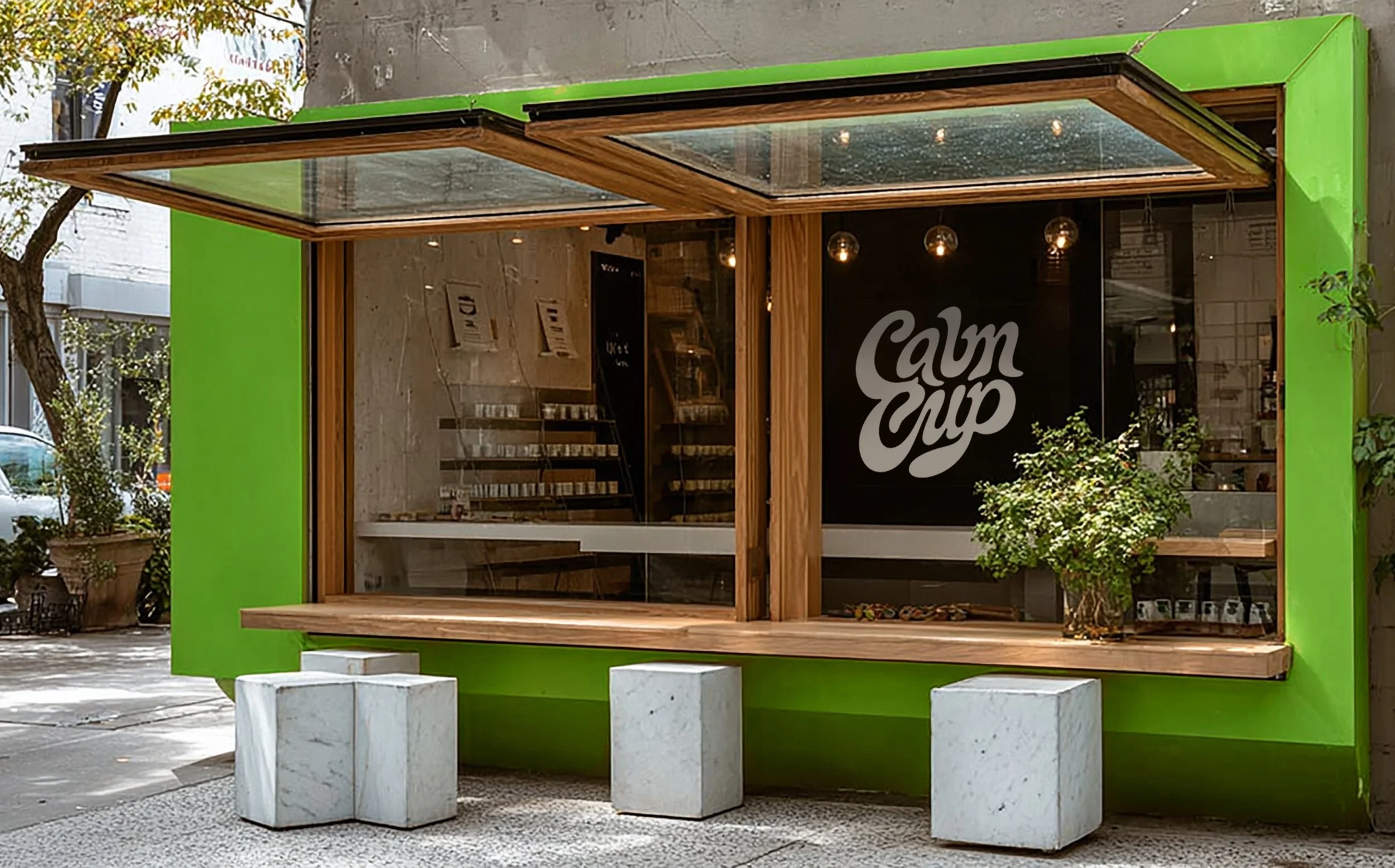
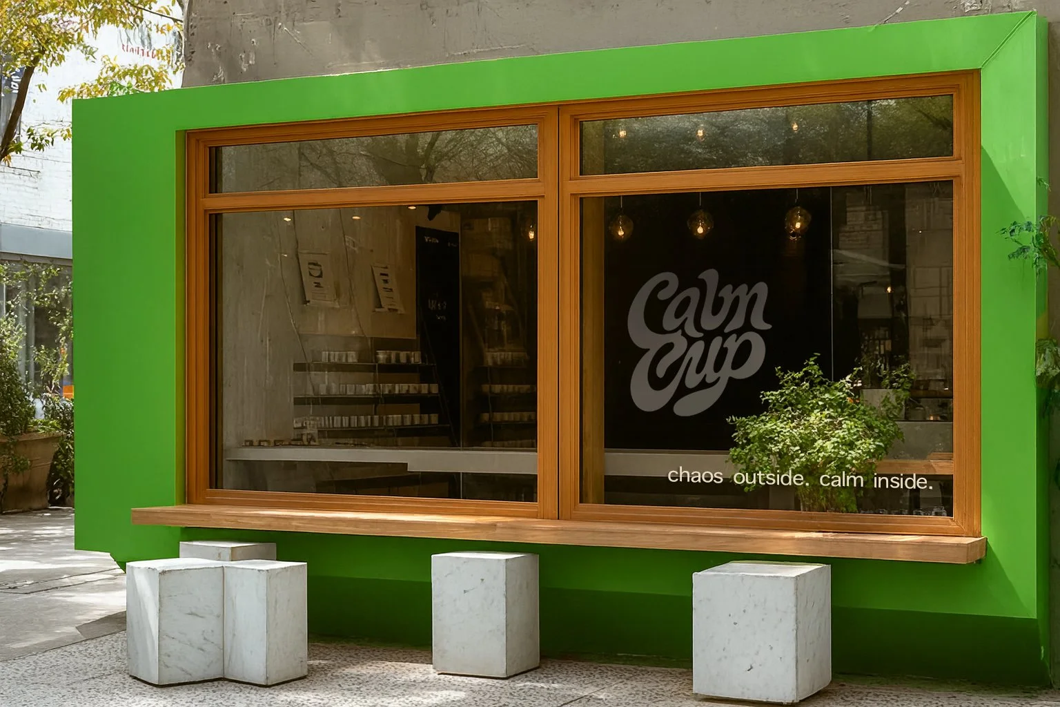
THE SHOP
The idea of the storefront is that it’s a portal/ literal window that opens up and transports you to the opposite environment. It’s like Yin/Yang two oppposites coexisting. The bright electric almost alarming green, represents the heightened emotions outside. Juxtaposed with softer, organic textures and neutral colors inside the space that represents a calm haven. The open windows shows the harmony coexisting between the two spaces.
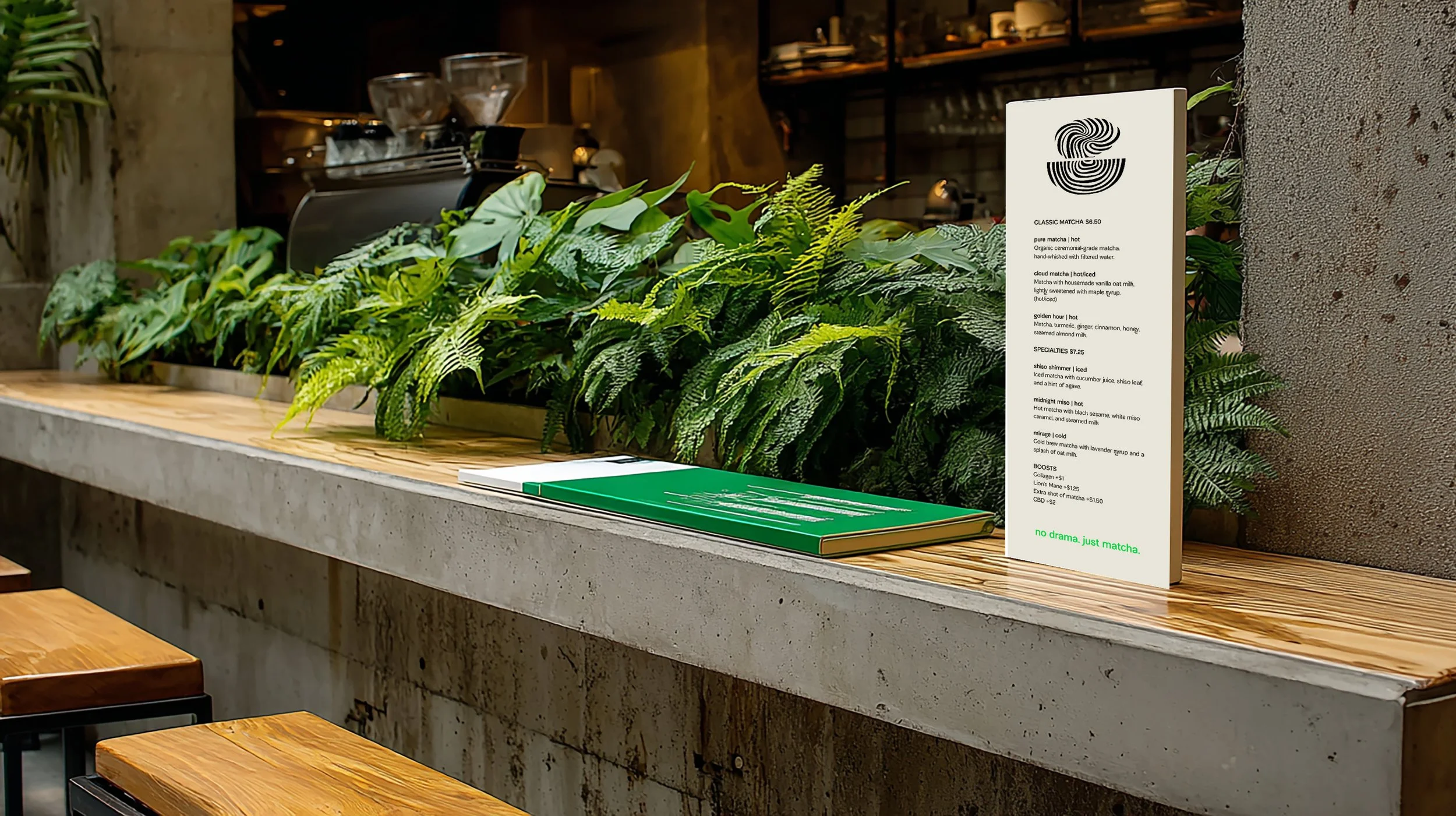
VISUALS
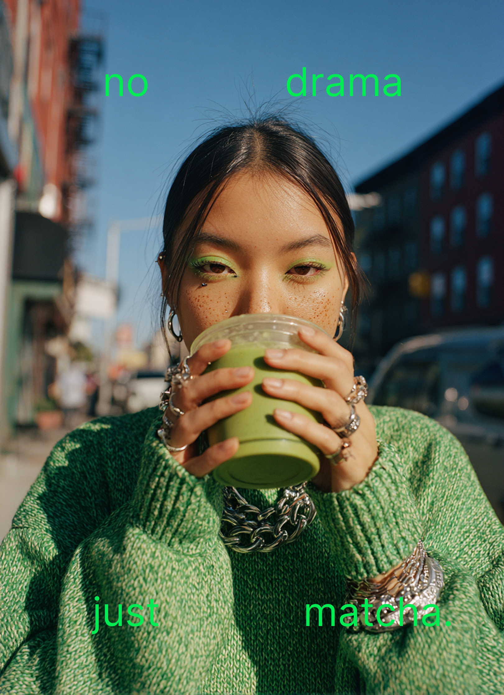
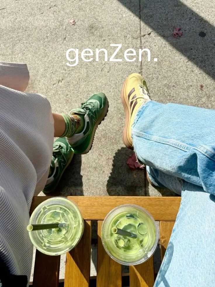
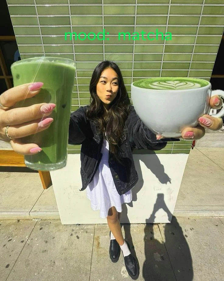
The Visual storytelling for the brand should be playful, youthful, and have attitude and paired with short, quippy, matcha focused copy, The visuals are a mix of UGC imagery and highly stylized imaginative campaign images.